Example 1
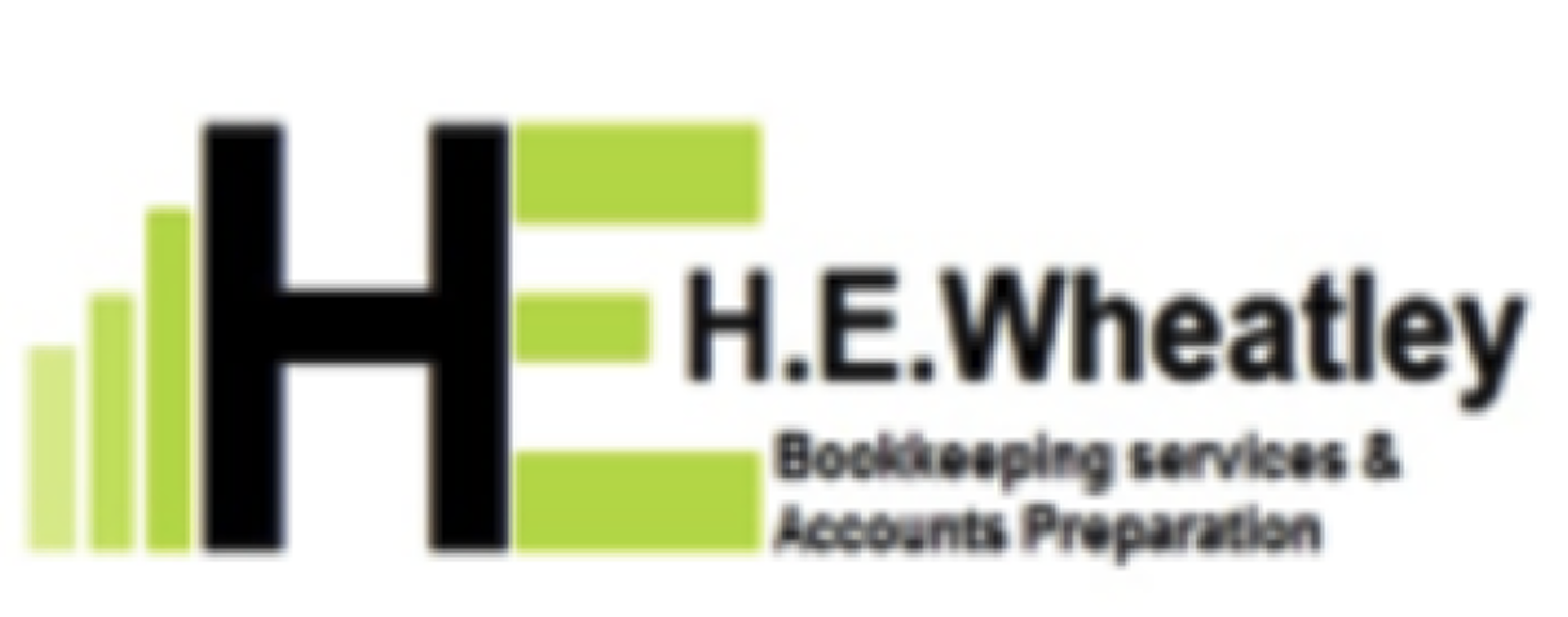
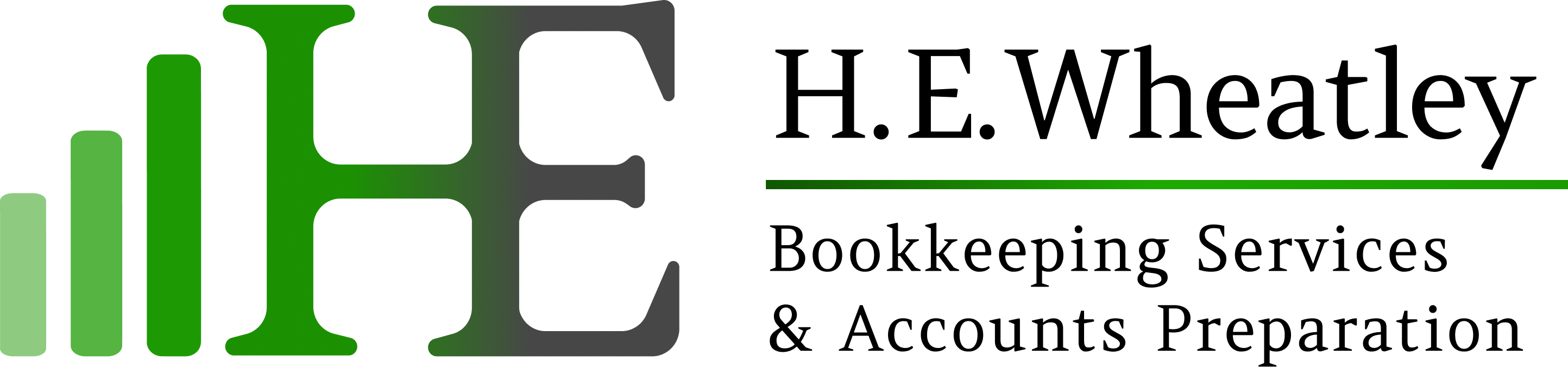
Kept the same vision but rounded and balanced the bars for a softened look. Merged the H with the E with an elegant gradient.
Same brand, same idea, sharpened.
Scroll to see what a Logo Hero refresh looks like in practice.
Kept the same vision but rounded and balanced the bars for a softened look. Merged the H with the E with an elegant gradient.
Introduced depth and character. Created a broken K to double as an apostrophe and balanced the lettering. Generated in high resolution for a sharp image.
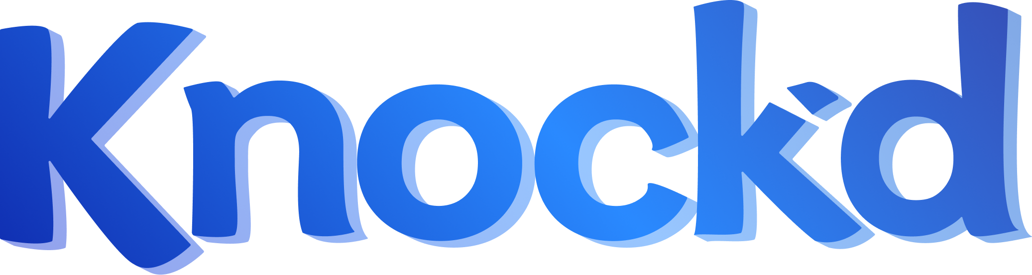
Retained the logo concept, just polished it. Updated the colour palette, introduced a modern typeface and integrated a strapline.
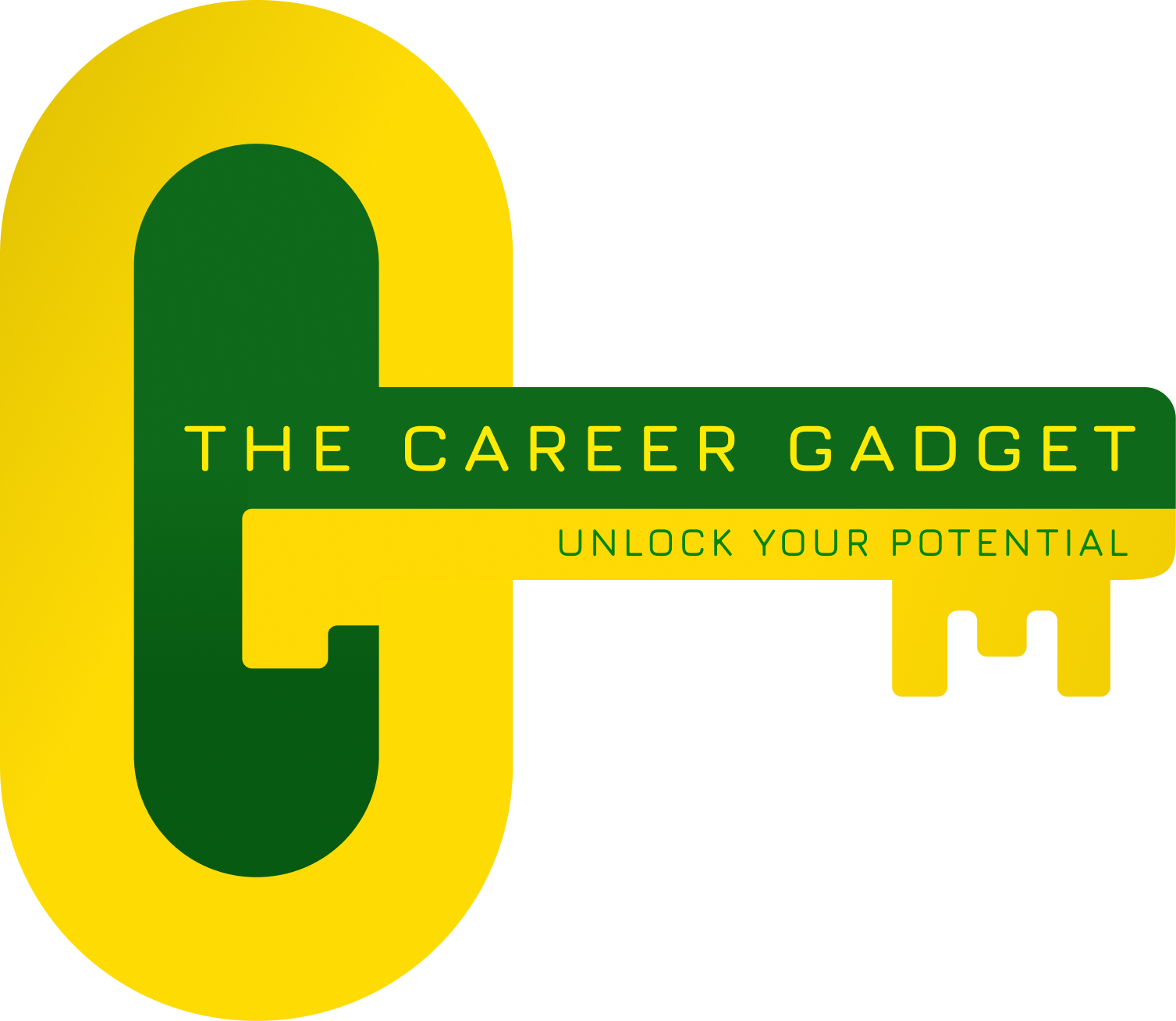
Feel free to reach out if you'd like to discuss any requirements
branding@logohero.co.uk